


10 Quick Improvements for your User Experience
 9 Minutes

How do you lose large numbers of users before they have even begun to use your digital product? Poor user experience. The impact of bad UX is enormous, as many studies have shown. Here or here, for example.
But as in most other areas, a good user experience needs a good strategy, especially in terms of design, and should be planned for from the outset. This saves time and money compared to the changes that come up during development.
But besides the big strategic decisions, there are also some quick design improvements that can take your UX to the next level. Without turning everything upside down. Here is a small guide for quick improvements:
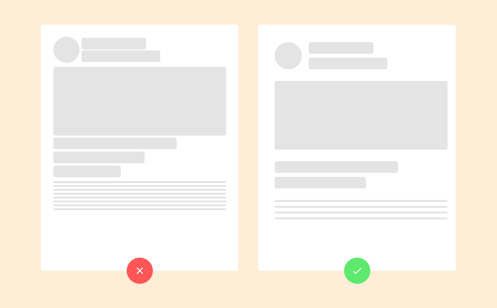
1. Provide white space
If you put more content in a small space, readers can also take in more content. It makes sense, doesn't it? But anyone who has ever been on a cluttered website knows the magnitude of this fallacy. If the spaces between the content are too small, we can't take in anything.
So what to do instead? Provide white space. Larger line spacing and enough empty area around an important element not only makes it seem smoother, but also helps us to focus on it. This way important content doesn't get lost and users find their way around more easily.
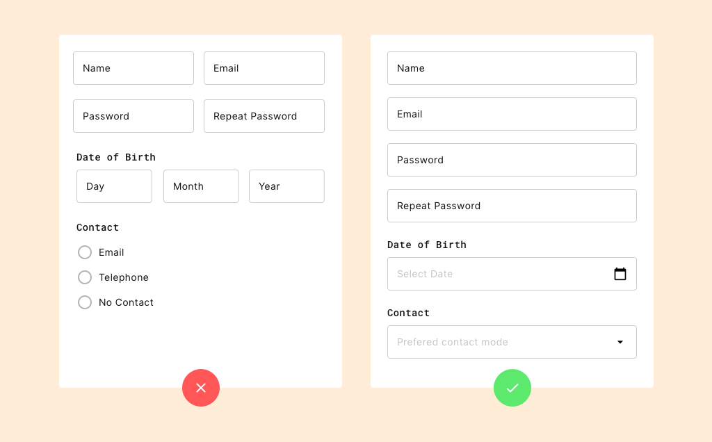
2. Straight form structure
You have successfully maneuvered your users to the registration form. All that is missing now is their data. But many forms make it unnecessarily difficult for them by not being purely vertical, but going left and right as well. This interrupts the flow of reading and writing and is an additional hurdle for them.
The more convenient method is a form in one column. This is more straightforward, easier to read and easier to fill out. If you want to do people an additional favor, you can also save some of the drop-down menus. For example, for birth dates.
3. The right icons
We humans are very good at extracting information from small symbols. This works equally well when searching for toilets and stairs as it does on a website. Download, email, folder, save or open. We are used to dealing with these symbols and interpreting them correctly. Often in a shorter amount of time than we would need for text with the same content.
But the saying with the picture and the thousand words only works if people already know the symbol. So if you really want to help people, you should stick to familiar symbols and not invent new ones. At least if you don't want to explain them with text again.
4. Clear navigation
Another example stolen from the offline world: navigation elements. They are a dream come true at every major airport, every motorway exit and whenever someone wants to go in a certain direction. Websites are no different, but still people are confused often enough by unclear information.
The rule of thumb if you want to do it better: Put everything where the users would expect it. The main navigation should be at the top or left and the number of menu items should be kept below five or six. For apps it may also move down. With quick tests you can find out if your setup works. But we'll get to them later.
5. The size of clickable items
Have you ever tried to tap something on your smartphone but failed miserably? Don't worry, it happens to everyone and it's not your fault. Far too often, clickable elements on smartphones are too small to be comfortably hit with your thumb.
That's why you should make sure that you design user interfaces that are big enough. This is the only way your potential users can really follow your CTAs and buttons. And that' s the whole point.
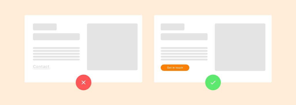
6. Inviting CTAs
Speaking of CTAs and buttons: Everything in your communication goes towards them and they should be appealing. A button should be large and visible enough to attract attention, but not too large to discourage. No one should have to ask, "Can I click that?"
Besides, buttons behave like real estate. Location is everything. Close to the CTA offer and surrounded by enough white space to stand out. Also, buttons should be rectangular and not contain too much text.
7. The choice of font
As is often the case, form follows function applies to the font as well. First and foremost, people must be able to read the text. Only then the question is asked whether the font is particularly fancy or pretty. Web fonts are perfectly designed for reading on screens and solve these problems.
It's also important to leave enough space between lines and not stretch the text too far. Finally, one last tip: contrast. The higher it is, the easier it will be for people to read.
8. The number of sliders
Websites and apps run - you remember the forms - from top to bottom. Sliders and carousels break up this flow. Not the only problem with them. Often sliders are not recognizable as what they are, but look like big pictures. It is often not even recognizable that the next one is next to it.
Clearly visible navigation elements, arrows, loaders etc., and already visible upcoming content can prevent these problems. But even with these, you should keep the number of sliders to a minimum.
9. Lots of text
How much content should you pack into a small space? Whoever paid attention to the point of white space knows that it shouldn't be too much. The same applies to text. With a few exceptions, people won't fight their way through large deserts of text to find an oasis of relevant content.
Make it easier for them! Mark relevant keywords, give sensible subheadings and images to hang on to. That way, more of your messages will actually get through to them.
10. The right tests
The last and most important tip for your user experience: tests. Test what you have designed with your potential users. One method for this are click-dummy prototypes. With this approach, you sketch processes and flows in your apps and websites and let potential users follow them.
You don't even need much feedback for this. 95% of all problems can usually be solved with a few users. This way you get early feedback and can make adjustments even before you put resources into development.
If you want to know the best way to approach Click Dummies, sign up for our upcoming workshop. We'll give you insights and guide you through the whole process of Click Dummy development.
Need help with UI and UX that goes beyond quick fixes?
