


Brand refresh — the journey to our bold new identity
We just launched our new website and showed the world our new design and identity. That moment was fantastic. Months of hard work, most of the time besides client projects and other deadlines, and countless discussions finally paid off. We now speak one language and are able to tell others who we are and how we can help them build better products. But, as it is with most simple things, getting there wasn’t that easy. So let’s start at the beginning of our journey that lead us to the Carrot & Company brand.
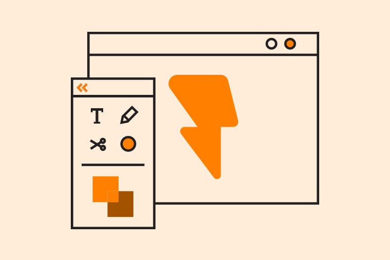
 The new Carrot & Company Website
We need a new logo
Or according to the first Jira story: “As Carrot & Company we need a design that communicates our image as a modern web development company that works with the latest state-of-the-art technologies and always strives for the best quality for our clients as well as our own products.”
But what’s a good starting point and what should the new logo represent and communicate? Many people already know us and recognise our design. How do we make sure we don’t confuse them? Why do we even need to change it? Those were just some of the first reactions.
First, we needed to make sure that a redesign is really the right path to go and that now is the right time to do it.
A lot had changed. We have a bigger team, awesome new people, a new design department, new projects. It felt like we’d outgrown the old carrot (logo) a bit. Another reason: It took us ages to create designs for new applications. Even designing a simple roll-up ended up being a difficult task involving countless discussions.
Also, it’s not just about the Carrot & Company logo. We have other products like feedbackr and even more in the making. We didn’t want to run into similar problems with them. So we decided that we needed more than just a new logo. We needed a system that makes it easier and faster to manage those things.
Initiating the process
To get everyone on board, we decided to run a brand sprint. It’s a relatively short and streamlined process (just three hours!) with six exercises to define the basics of our identity. We grabbed all of us (especially the founders), prepared all the necessary material (including tons of post-it notes) and locked ourselves into our meeting room for, well, a little more than three hours to be honest.
 The process of a brand sprint by Jake Knapp and the team at Google Ventures.
We’ve done this with clients already, but with your own team the experience can become daunting. Often no one in the room had the same, not even a similar explanation. Everybody had a very different picture of the company and its future. But this process assured once again how desperately we need to do this.
The outcome wasn’t a ready to use brand guide or a motivating mission statement. It was a first draft. Now we had lots of content and ideas to work with. They needed to be structured, streamlined and put into short and easily remembered sentences. We defined things like our history and vision, benefit, differentiation, audiences, character, values, etc.
We set the goal that the main “ingredients” of our brand should fit on one A4 page. No one wants to read a novel and you can’t remember it if it’s too long. So the foundation for all future work was laid, one document, a single source of truth.
A makeover for a carrot
With the workshop done and the core of the company defined, it was much easier to start with the design. Every time we felt stuck or didn’t know what was the way to go, we had a look at the document and asked ourselves: What aligns best with the ingredients we defined?
The old carrot (logo) didn’t align with our actions anymore. Our feeling was right: We’d outgrown it. Even though many people were curious about the name and loved the story behind it (that’s something for another blog post), the carrot itself didn’t tell much about what we’re actually doing.
![]() Our old logo served us for many years (left), but it was time for a change (right).
Our old logo served us for many years (left), but it was time for a change (right).
After exploring first ideas, we settled on the one that incorporated the agile and technology aspect, while still keeping the carrot alive. Making the redesign a logical evolution from the original logo people already know. The shape of the lightning adds the techy appeal and makes it feel more agile and in motion. The colour helps you still see the carrot. It’s also more simplistic and it works in tiny sizes like the favicon in your browser.
Building a flexible system
The coolest thing about the new logo? It’s not just one logo. We created a dynamic branding system with different elements and layers that help us grow and sustain our brand(s) in the future. We rely on a few simple ingredients: grid, colour, typography, logo, voice and illustrations.
 The dynamic Carrot & Company brand system based on Irene van Nes.
While some elements like grid, typography and voice are fixed and should be consistent throughout all applications to ensure easy recognition, others are dynamic. This approach allows for flexibility. Other logos for projects or sub-brands can derive from the original logo, following this system.
They’re still seen as part of a family, but they can communicate their own ideas and values. This even works for brands that are further away from Carrot & Company like our feedbackr app. It has a different visual identity, but still shares some common basics, that help us save time and money.
 Different logos from our system.
Instead of defining every tiny detail of the corporate design in a huge design manual (who wants to read manuals?), we summarised everything in a short brand guide that explains the crucial parts, but gives room for creativity and future challenges. We also added a section where we collect different designs for inspiration.
This way designers (and non-designers) get a feeling for how things should look without feeling limited in their creativity. For us, coherence became much more rewarding than overly policing consistency.
We need some rules, sure, but we also need our identity to fit our culture. It should be easy and fun to use.
One last and important step was to make sure that no-one in the team was missing out. We prepared templates (Google Docs and Slides, a UI design library, etc.) ready to use for everyone and have our logos and other brand assets easily available for the whole team. Everyone is encouraged to produce great things, you don’t need a design degree for that.
 A minimal and practical brand guide.
And of course we created our own merch — isn’t Christian looking good in his new CNC logo sweater?
 Christian Haintz wearing his Carrot & Company logo sweater.
Conclusion
It was a hell of a ride. Sometimes questioning everything up to the existence of our company. But in the end it was worth it. Especially now, with people using the ingredients and producing more and more applications. It’s great to see everything in action and how people are using the pieces to build awesome stuff. The identity has come to life and with every new application, every new icon and illustration, it becomes easier and faster to work with it.
In the beginning we spent way too much time in loops of the same discussions. But it wasn't a client project. It was our baby. Especially for Karin and Christian, the founders of Carrot & Company, it meant a lot to change everything. And it’s such a pleasure to see how they can identify with the brand and how they proudly show it to the world.
Do you need help refurbishing your brand identity?

